NGO Website Design & Development · READ Uganda
Nearly Two Decades of Rural Impact, Finally Told Clearly
READ Uganda has worked with rural communities since 2007, supporting 170 savings groups that have mobilised UGX 1.38B. We built a website that lets funders and partners see that impact in seconds.
Client
READ Uganda
Category
NGO Website Design & Development
Services
4
Outcome
6 wins
// 01 — challenge
The challenge
Rural Efforts for Action in Development, known as READ Uganda, has spent nearly two decades working alongside women, youth, persons with disabilities and people living with HIV across ten districts and sub-regions of Uganda. The work is broad: HIV care and treatment, village savings and loan associations, enterprise training, agricultural extension, wetland conservation and consultancy. The results are real, with 170 savings groups, more than 5,080 members and UGX 1.38 billion in savings mobilised. But for a funder, a government office or a partner organisation landing on the site for the first time, none of that was easy to find. Programmes, numbers and stories from the field needed to come together into one clear picture of who READ Uganda is and why they are worth partnering with.
// 02 — approach
Our approach
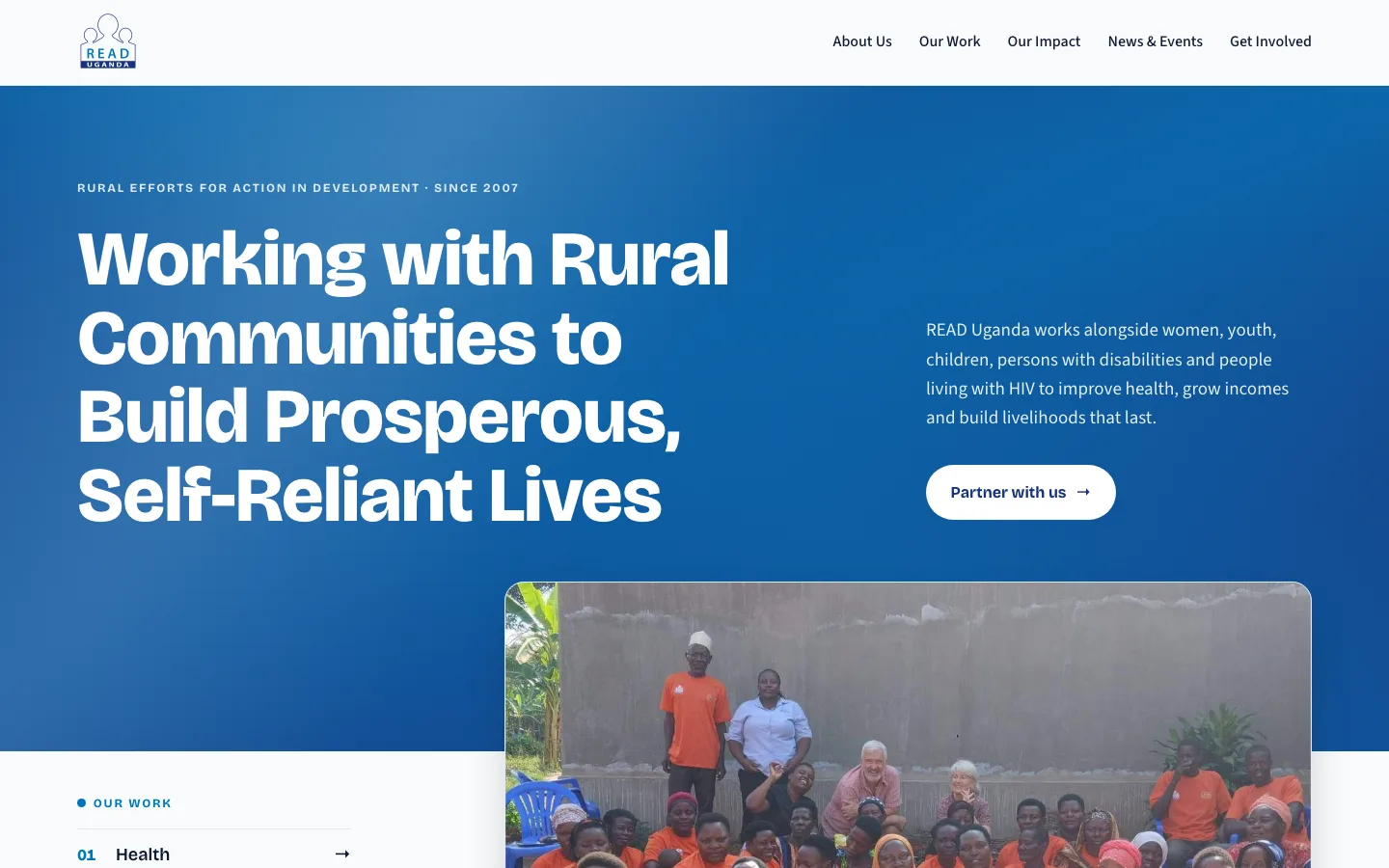
We designed and built a WordPress website that leads with the mission and backs it up immediately with evidence. The homepage opens with a confident statement of purpose and a single call to action, Partner with us, aimed squarely at the funders and organisations READ Uganda wants to reach. Right below, the programme areas are laid out as a numbered, scannable list, followed by a record section that pulls the headline figures straight from the annual report. A who we are section establishes credibility with the NGO registration number, founding year and office location. A story from the field puts a real face on the numbers: Musimenta Rosette, a single mother of five who used savings group loans to start a business, pay school fees and buy land. A where we work section maps all ten districts and sub-regions, and a partners strip shows the organisations already backing the work. The visual direction pairs a deep, trustworthy blue with Bricolage Grotesque headlines and Source Sans body copy, giving the site the presence of an established institution while staying warm and human.
// 03 — results